The real Atelier Hamidi identity
Every value on this page was taken from the live site at atelierhamidi.de (November 2026) — logo files, colors, fonts, photography. Nothing was invented; where a call was made for the demo, it is marked as a demo decision.
Logo & marks
Primary lockup is the transparent wordmark (2170 × 725 px, ratio ≈ 3:1). The brass stamp is the atelier’s own seal — used in this demo as the quality-check mark. The historical sign is kept for reference only.
Rules kept from the site: the logo is never recoloured per component, never stretched (always compute size from the 3:1 ratio), and always sits on a calm area — light, dark night, or brass wash.
Color
Palette read from the site’s CSS and inline styles. Ink and paper carry the layout; brass is the craft accent; red is a signal only — never decoration.
Usage ratio in the demo ≈ the site’s feel: mostly paper & ink, brass as a thin gold thread (~10% of any surface), red under 5% and always with a text label. Semantic states add one quiet green (#2E7D4F) for “paid/passed” — a demo decision, not a site value; it never appears as decoration.
Typography
The site loads Cormorant Garamond for display and Manrope for interface text — both web-loadable, so the demo uses the real faces, no substitution.
Hero and page titles. Tight leading (1.05–1.15), no letter-spacing tricks.
Interface and running text at 16px, line-height 1.6. Dense operational screens drop to 14px for tables and meta — never below 12px.
Kicker · 11px · .16em
Semibold labels sit above inputs, chips and table headers, always sentence case except kickers.
| Role | Face | Size / leading |
|---|---|---|
| Hero title | Cormorant Garamond 500 | clamp 44–78 / 1.05 |
| Section title | Cormorant Garamond 500 | 34–50 / 1.1 |
| Card title | Cormorant Garamond 500 | 21–26 / 1.15 |
| Body | Manrope 400 | 16 / 1.6 |
| Operational text | Manrope 400–600 | 14 / 1.5 |
| Kicker / micro | Manrope 700 | 11–12 / 1.2 · caps |
Components
Sharp corners (2–4px), 1px hairlines, quiet shadows. Buttons state their intent: ink = go, brass = money, red outline = careful.
44px minimum target, brass focus ring on keyboard focus.
Classification badges are design annotations (brief §13) — visible in the demo for the CEO, hidden in production UIs.
- Thu 13 Nov · 16:00Quality check passed
- Fri 14 Nov · 09:02Customer notified — ready for collection
- pendingCollection & payment
Photography & image treatment
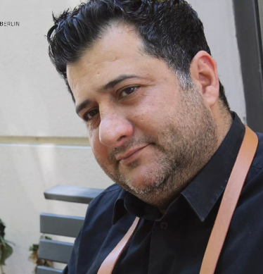
Only the atelier’s own photography is used — workshop, hands, materials, finished work. No stock, no AI-generated shoemakers. Content images keep their full frame; crops are reserved for decorative backdrops.
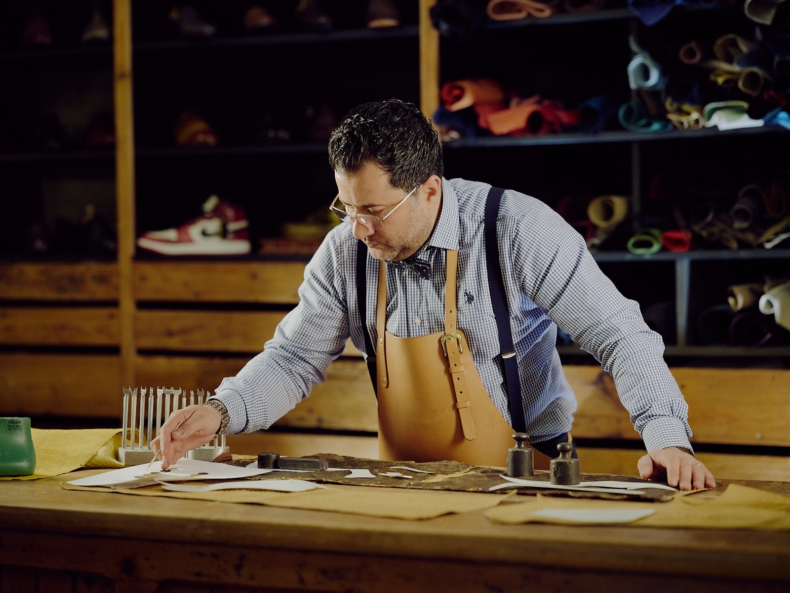
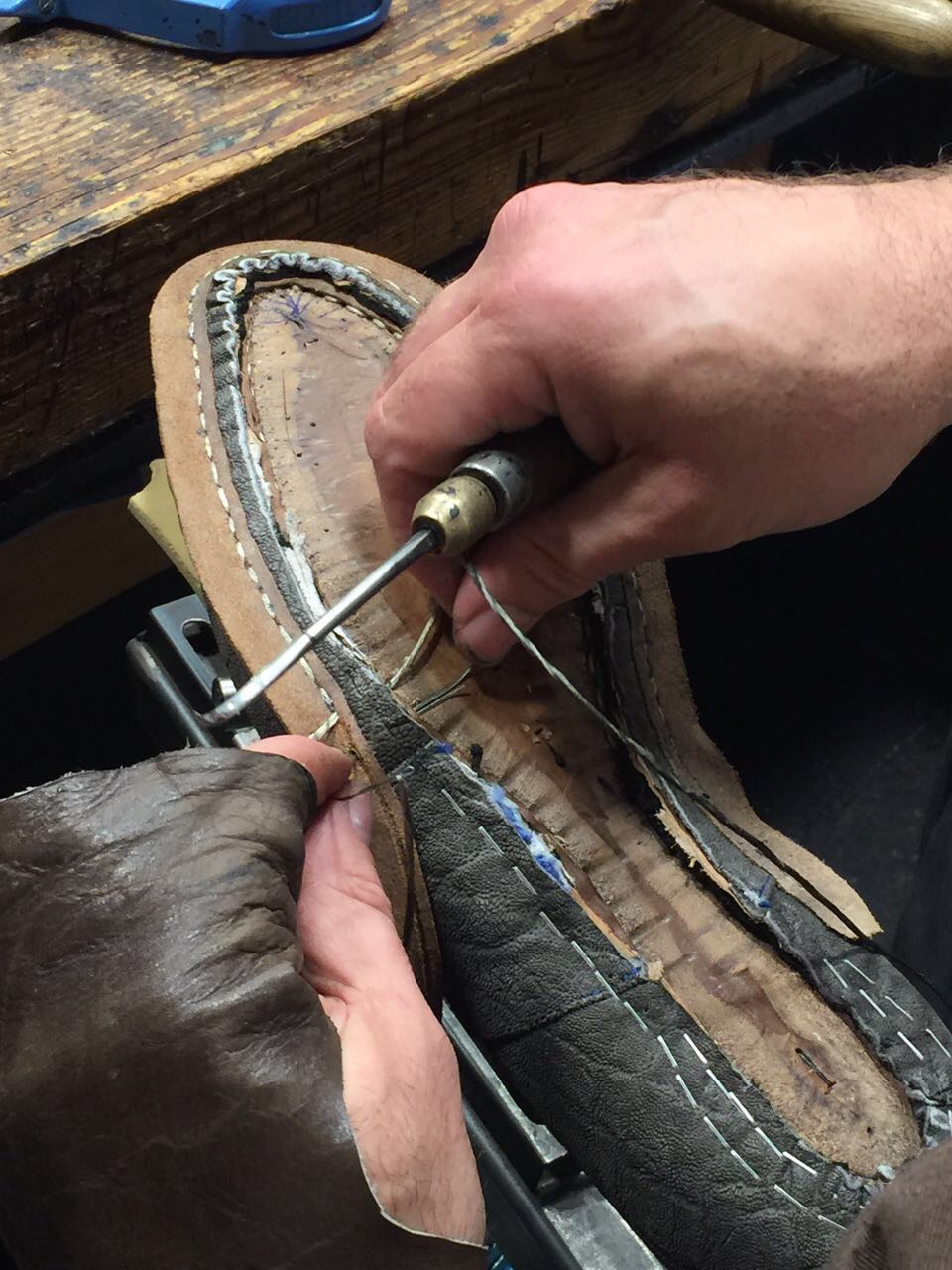
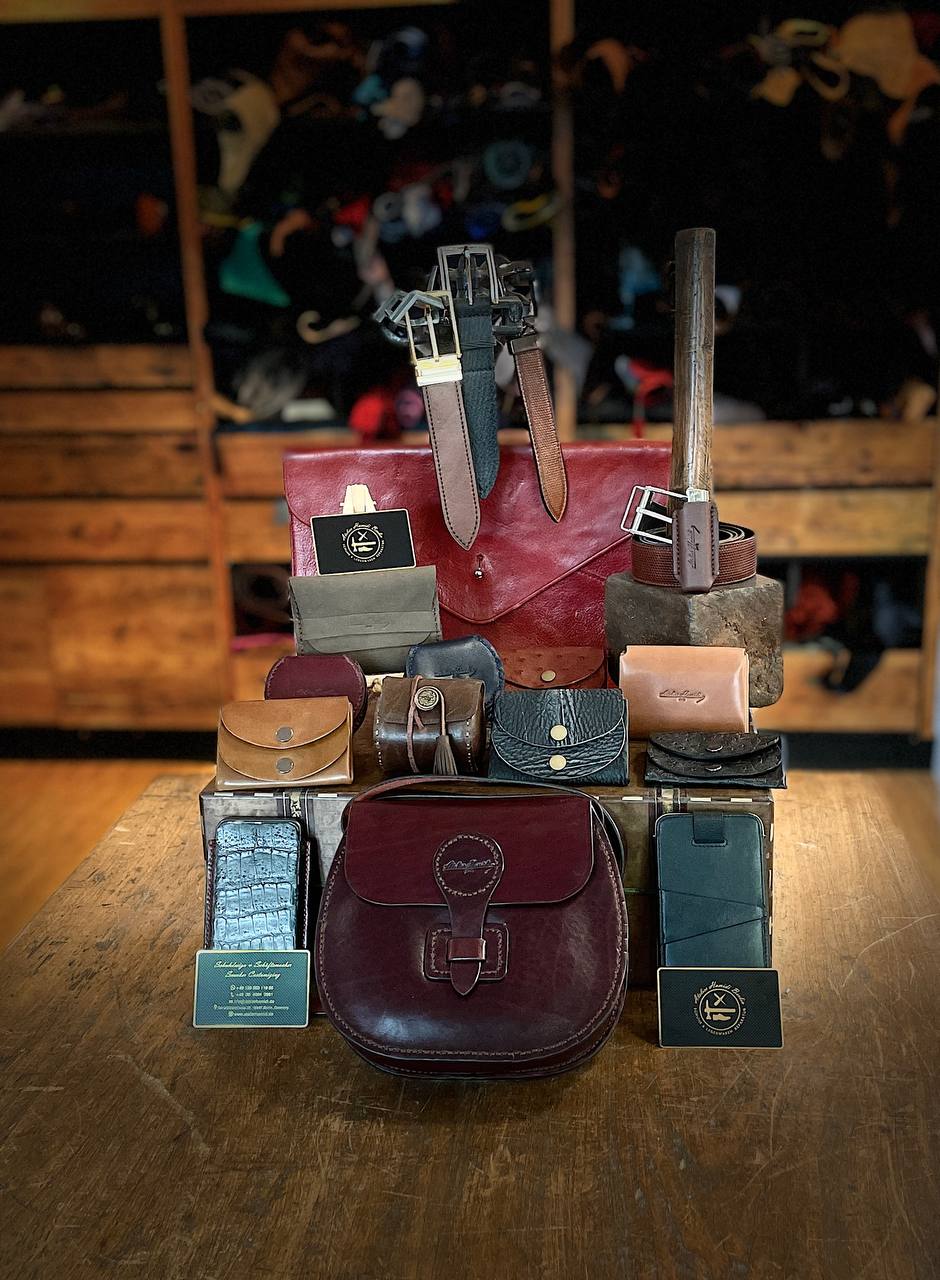
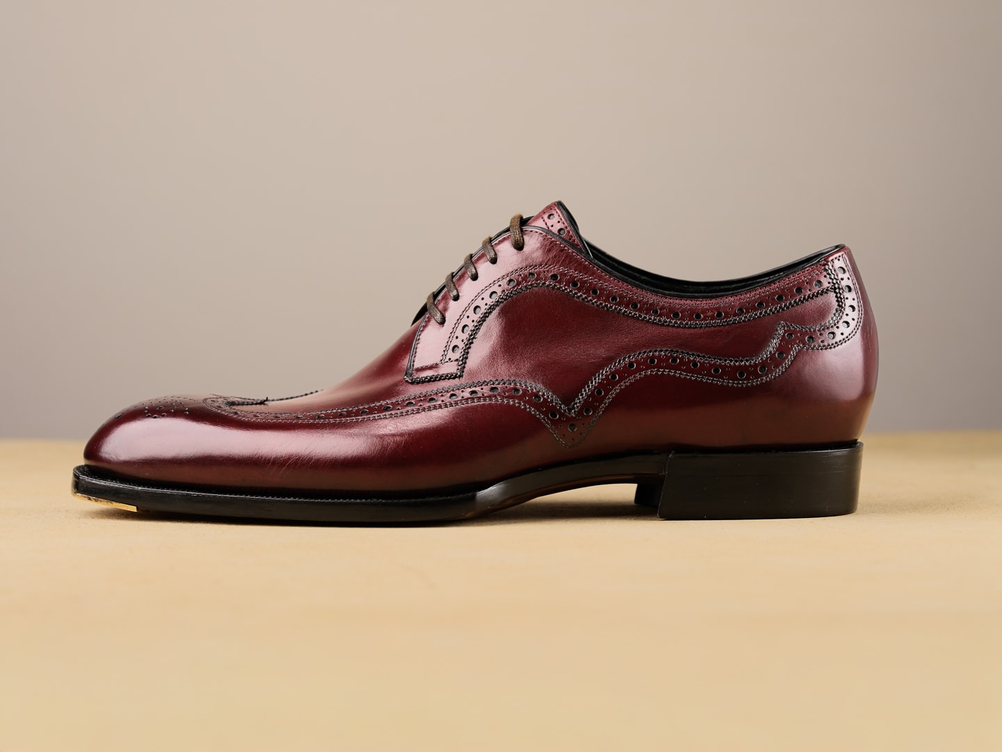
- Photography direction: honest workshop light, hands and tools visible, finished work shown proud.
- Intake photos are part of the record — always shown with date and taker in internal screens.
- Decorative backdrops may crop; product and job photos never crop or distort.
- Where no real product photo exists, a labelled tile is used — never a misleading stand-in photo.
Spacing, layout & icons
4/8px base grid — 4, 8, 12, 16, 24, 32, 48, 64, 96. Cards pad 24, dense operational rows pad 12. Max text measure ≈ 65–75 characters.
One line family: outline, 1.5px stroke, round caps, 24×24 grid. Colour follows text; icons never carry meaning alone.
Customer surfaces: editorial grids, serif headlines,
photography-led, 32–96px spacing.
Operational surfaces: sidebar navigation, dense tables and
boards, 12–24px spacing, same ink/paper/brass tokens.
Quiet and quick: 150–250ms, ease-out on enter. Motion only explains state — a card moving across the workshop board, a payment resolving. No decorative animation; reduced-motion respected everywhere.
assets/credits.json. Photographic subjects were assigned by best match from the
site’s own galleries — confirm final assignments with the atelier before external use.